Click to download the PDF version of the Logo Guidelines
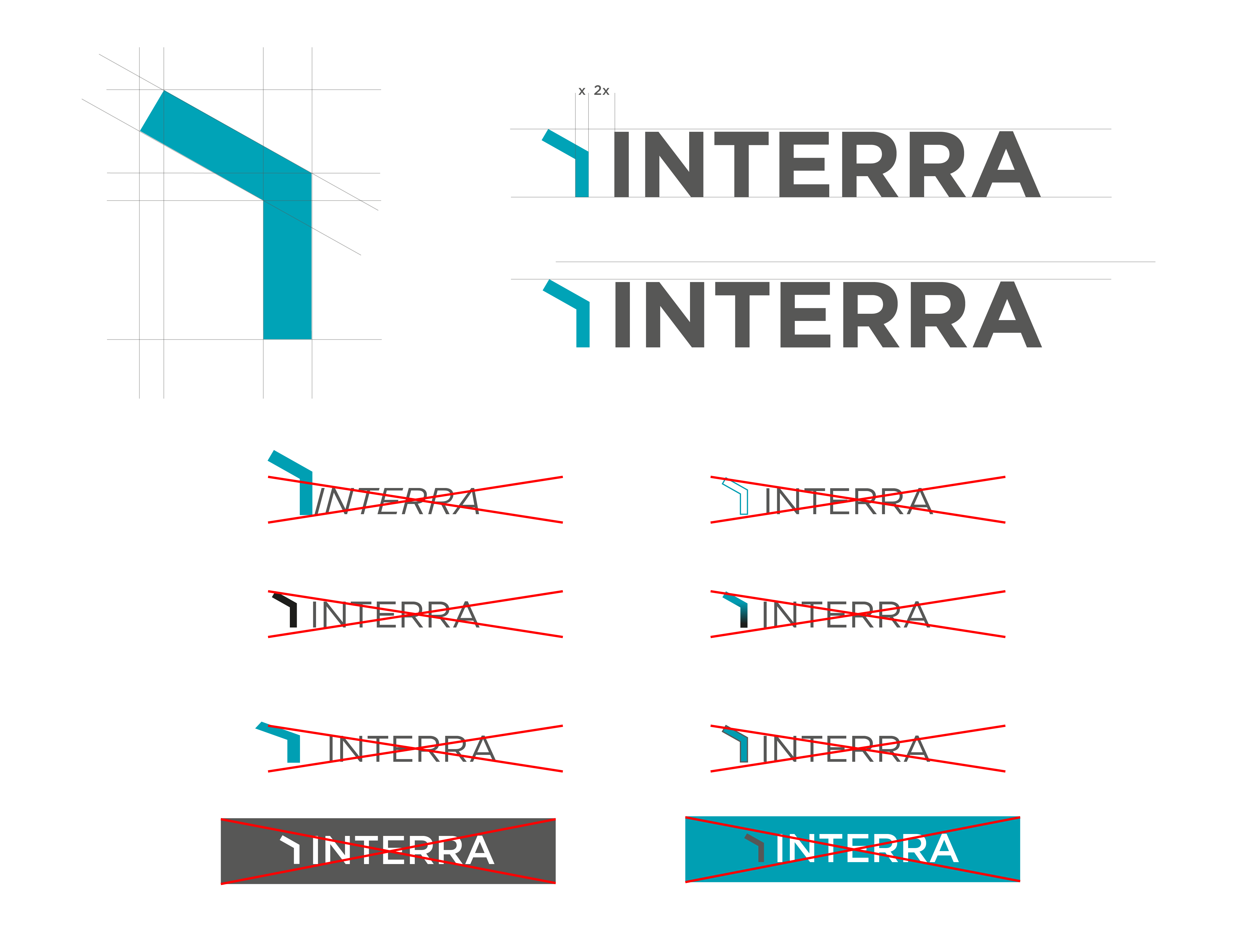
 INTERRA Logo
Interra logo is designed with the logotype and applied by making minimal changes on it, such as changing the line of the letter E.

Click to dowload.
Download other versions of the INTERRA Logo below.

Click to download. Click to download. Click to download. Click to download.

Click to download. Click to download. Click to download.
INTERRA Icon and Misuse
INTERRA Icon should never be changed or deformed for any reason. Adequate safety space should always be left around the INTERRA icon and should not be placed as punctuation at the end of sentences, etc., but should always be at the beginning of a word/sentence.
Find below the correct and incorrect usage.
INTERRA Colors
The basic usage color of the INTERRA logo is turquoise. It should definitely be stated as such or the colors labeled in the manual should be taken into account. INTERRA logo should not be used in any color other than turquoise, white, black and anthracite specified in the logo guidelines.
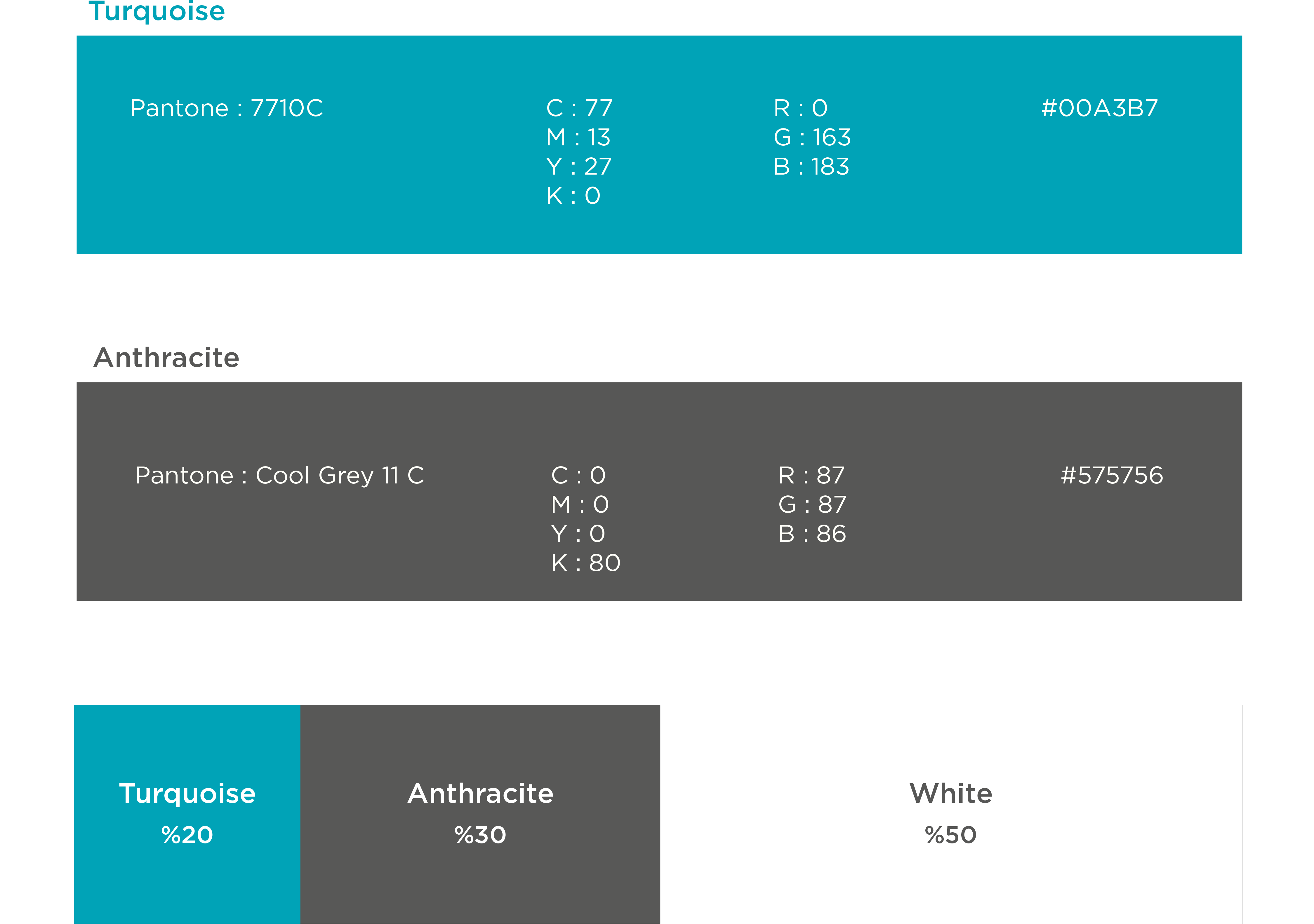
*The usage rates of INTERRA colors in design studies should be similar.
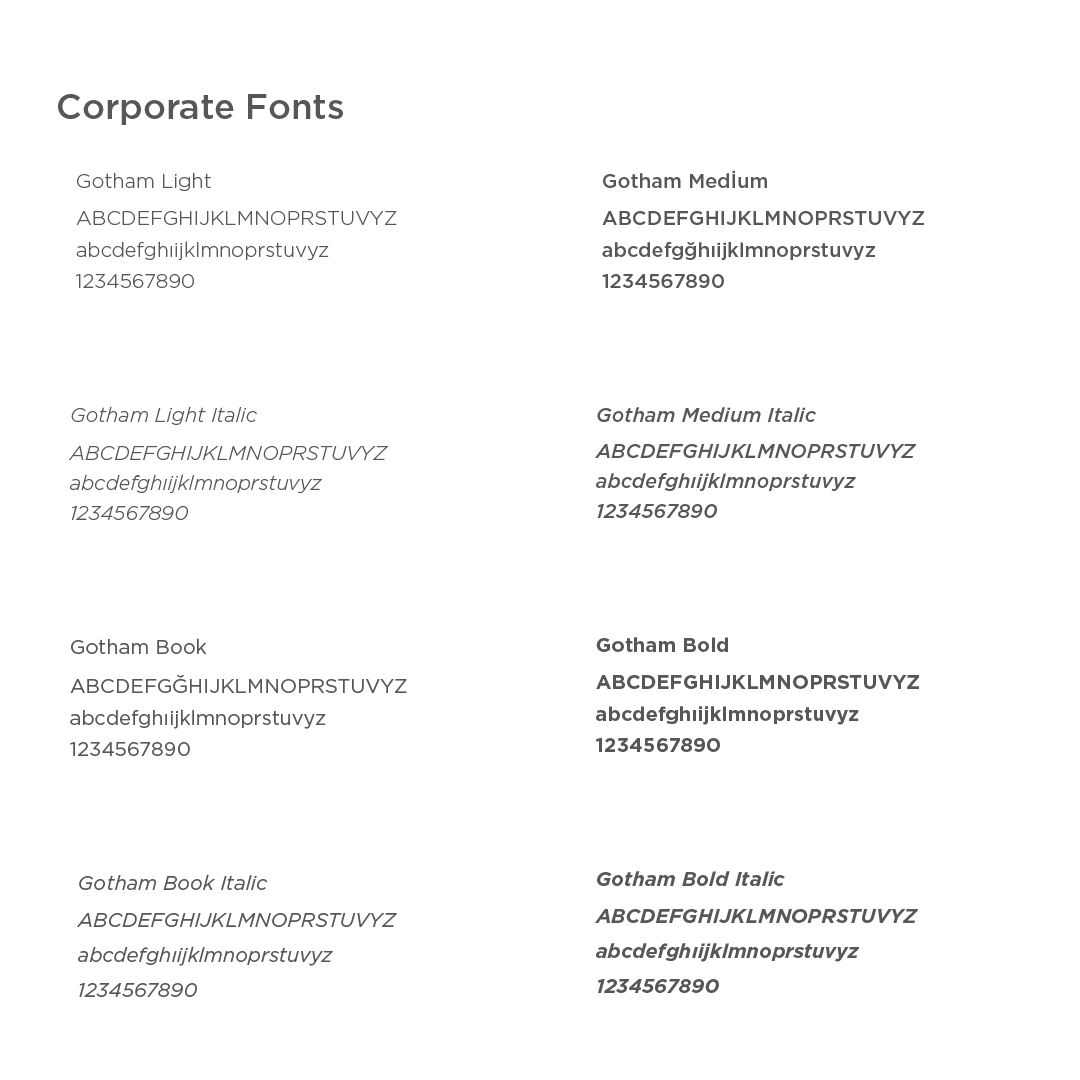
INTERRA Corporate Font
INTERRA's corporate typeface is the Gotham Font Family.
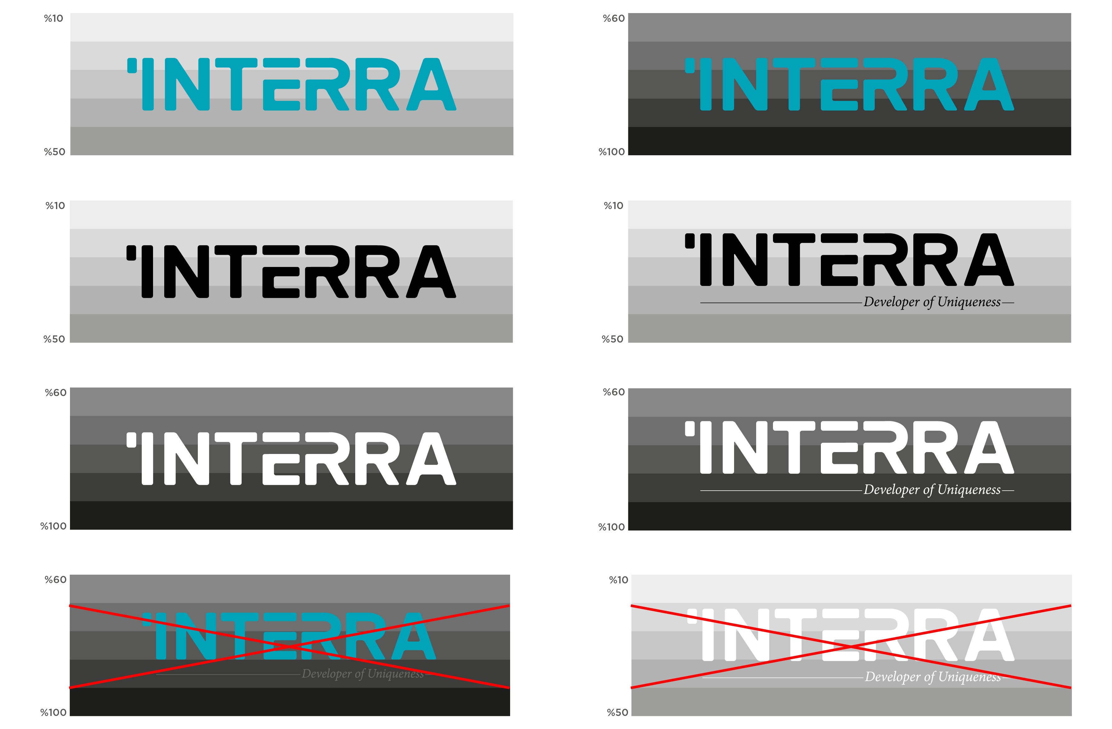
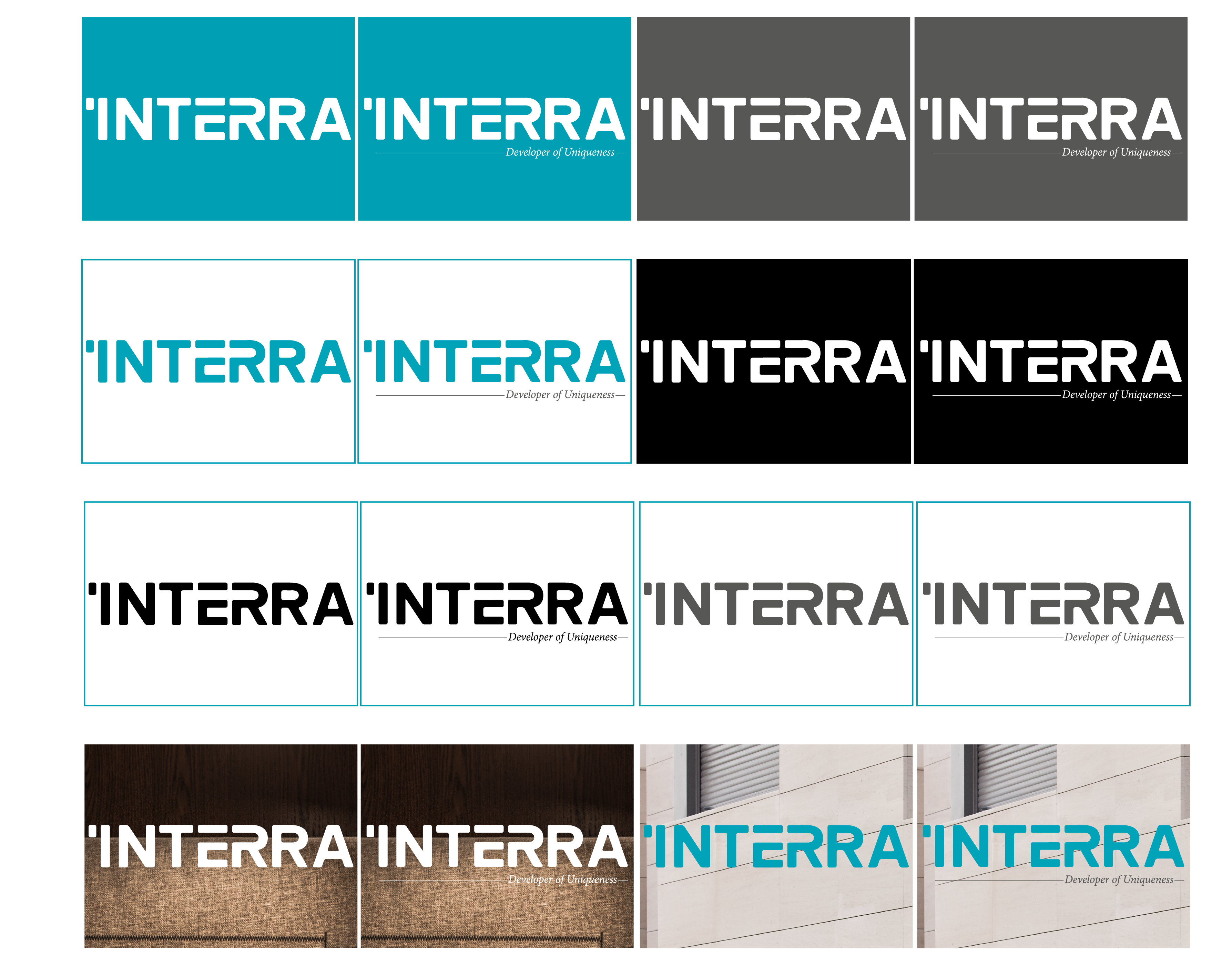
Usage of INTERRA Logo on Different Grounds
The correct usage of Interra Logo on different backgrounds is as follows.
What the color of the Interra logo should be depends on the color value of the ground it will be on. The logo should contrast with the background color in order to increase its legibility.

* The version of the INTERRA logo with the slogan can only be used when the K value is between 10 and 30%.
If the K value is more than 30%, the version of the INTERRA logo without slogans should be used..
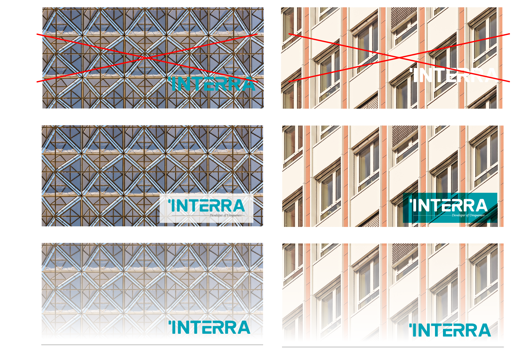
The correct usage of the INTERRA Logo on different backgrounds is as follows.
The examples below show that the INTERRA Logo lacks contrast and loses legibility on a complex background. The correct and incorrect uses of the INTERRA Logo on a complex background are as follows.
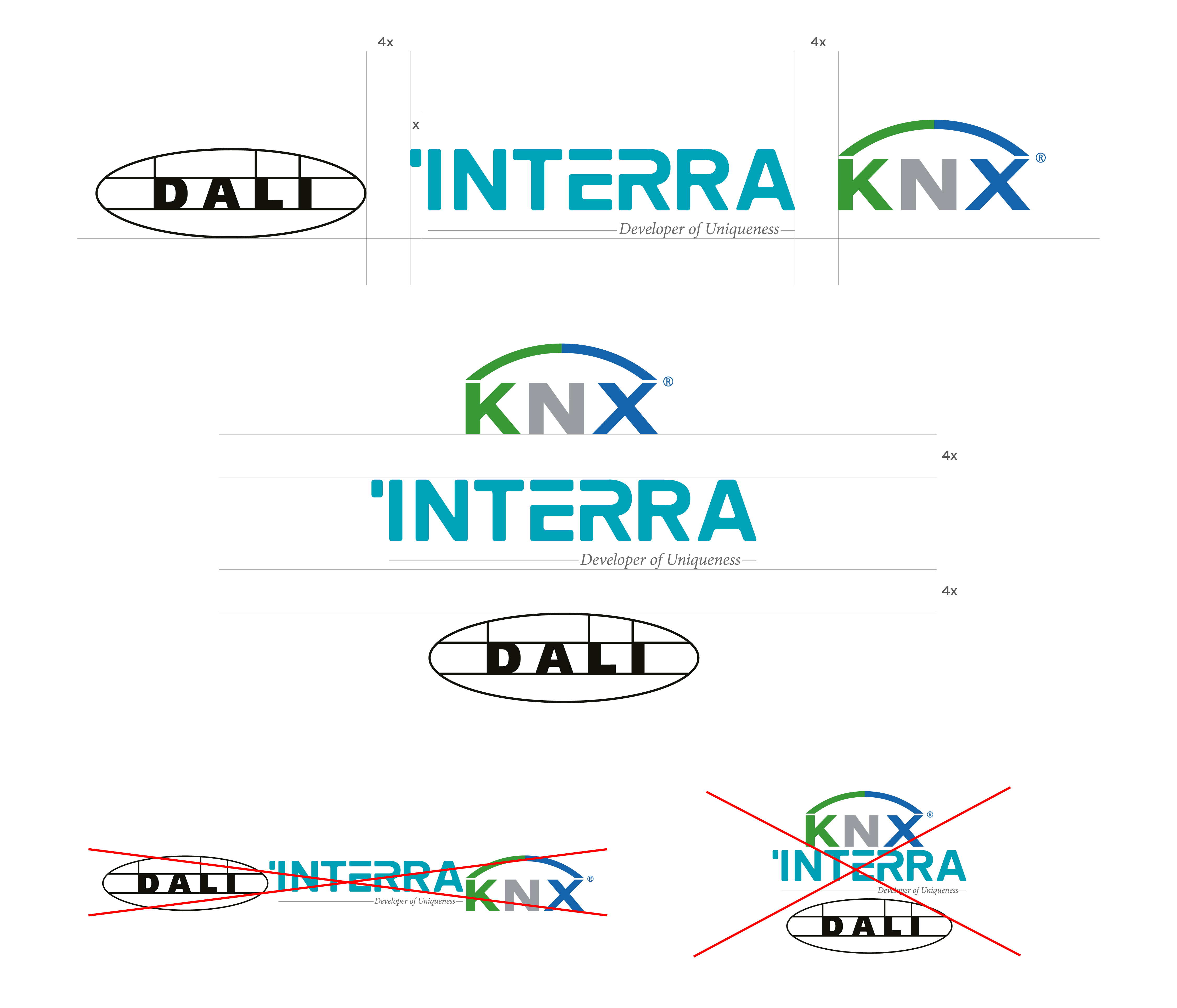
Usage of INTERRA Logowith Different Logos
The correct usage of INTERRA logo together with the logos of the partners is as follows.
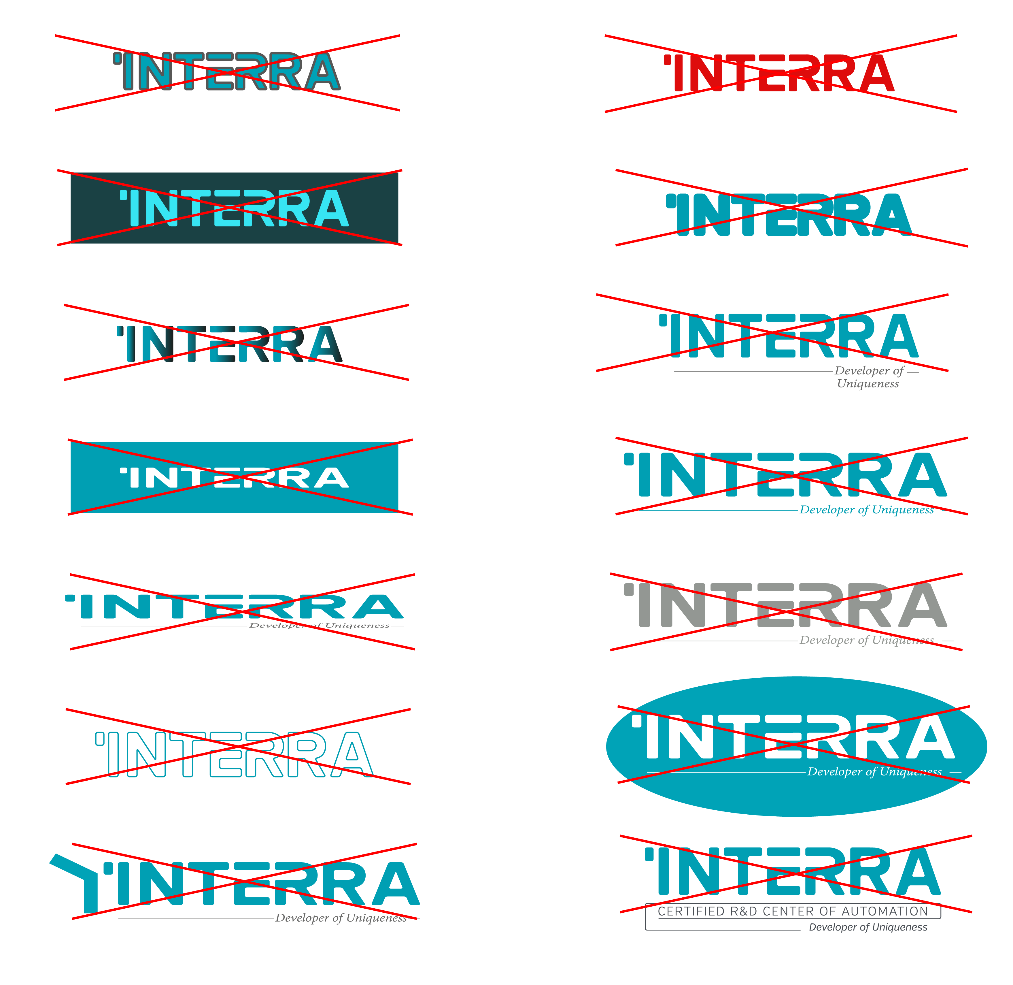
Misuse of INTERRA Logo
INTERRA logo should never be changed or deformed for any reason.